

Imagine aliens surveying Earth, before landing on our planet. They would busy themselves with mapping our critical zone. This is what we are doing now, with Mars. We send rovers and orbiters, on missions to “reveal the secrets of the Red Planet”. We study the geology, composition of the atmosphere, presence of water, temperature ranges, available minerals and metals, and much more.
How would aliens map our planet? Conventional cartography is just that, a convention. Our most common maps describe the surface of our planet, for the purpose of navigation. Usually, they are political maps, showing national boundaries. They are lifeless and describe topography, not bio–graphy. The maps do not show the complex relationships and exchanges taking place in our biosphere. We leave such efforts to specialists and scientists, and are satisfied with a two-dimensional representation of surface features.
Our maps are economic, not biospheric
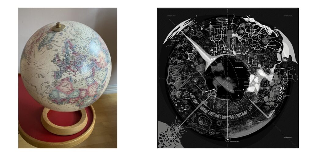
Aliens would want more, as we do when mapping the critical zone of Mars. Below is my globus, with a conventional, cartographic image of Earth. It contains a lot of information, but much is missing. Yes, I can distinguish nations, and that has become a problem. I see oceans and their currents. The globus is handy, should the political geography in my head need a refresher. Yet, current events have already erased or shifted some of those national boundaries. Sea-level rise will do the same to coastlines, because of melting ice on Greenland, in the Himalayas and the Antarctic. Even the direction of ocean currents is in play now, due to global warming interfering with Earth systems. Standard maps are superficial and inadequate. They show the surface of Earth, but not our biosphere. Aliens surveying life on Earth would be charting the latter. Those of us who seek to repair Spaceship Earth, will want to use their maps, and not our old ones of conquest and political domination. To the right of my globus is a map of the kind aliens might develop of Earth, depicting processes that Homo economicus ignores. To visiting aliens, this map would be of the highest importance. My globus can show borders over which we fight and across which we trade. The image on the right portrays biospheric processes we need to reappraise and better understand, with a dynamic that respects no borders. (The image is a detailed mapping of the critical zone of “the chemical valley”, which lies south of Lyon, in France.)
Our old maps are dangerous
If we obey the norms that shape conventional maps of Earth, then our efforts to carry out the necessary repair will crash and burn. We need a new map, a new way of seeing our planet. Only then can we draw benefits from the complex interrelationships our policy makers are presently ignoring.
We need a thorough and interactive map of what is known as “the Critical Zone“. The Critical Zone is the “heterogenous, near surface environment in which complex interactions involving rock, soil, water, air, and living organisms regulate the natural habitat and determine the availability of life-sustaining resources”. The nations that have spent nearly thirty years on 25 ineffective COPs, have not understood they are “determining the availability of life-sustaining resources”. Lumumba Di-Aping, when chief negotiator for the IPCC’s G77-group of Developing Nations, said: “We thought the negotiations were about natural science. Now we have understood they are about the economy. The Western nations have, of course, understood this all along.” Di-Aping was right, the negotiations should have been about natural science. Instead, they have been rooted in economic fantasies that result from all nations clinging to unrealistic growth goals. Maps of the Critical Zone pull these fantasies down to reality. Without a Critical Zone map we fly blind in our struggle against climate change. We risk causing more harm than good, even when our intentions are the best.
Our old maps trick us
Here is an illustration of how our view of volume and mass is distorted by the familiar view of the globe. It has been created by the U.S. Geological Survey. There are three blue water spheres in this image. The reaction I usually get when showing this graphic to someone is shock and disbelief.
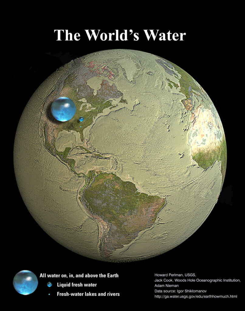
The sphere with all the water on Earth is 1350 kilometers in diameter and is shown in correct proportion. This sphere contains all the water on our planet, including water ice-locked on Greenland, in the Hindu Kush Himalayan region, and on Antarctica. Efforts to repair Spaceship Earth would have begun sooner if we had known how small our water resources are, compared to how large we believe them to be. The cartographic representation—which makes us believe we live on a Blue Planet—creates that illusion by smearing water, as a thin layer of deceptive make-up, across the ocean reservoir of our planet. We have filled this resource with pollution, plastic and garbage, because we tricked ourselves into thinking the ocean was vast, almost infinite. We suffer from many such delusions about our planet’s essential resources, because of the ignorance imposed upon us by conventional cartography.
Creating dynamic maps of the Critical Zone
We must abandon the cartographic representation and try to understand the interconnections between “rock, soil, water, air, and living organisms (that) regulate the natural habitat and determine the availability of life-sustaining resources“. A first step is to turn the planet inside-out. The familiar globe lends too much importance to what we cannot reach. It shows us the interior mass and volume of the planet, with just a thin veneer representing our Biosphere, with its Critical Zone components.
What follows owes a debt of gratitude to Alexandra Arènes and her collaborators and co-authors. Their book, “Terra Forma – Manuel de Cartographies Potentielles“, is an astonishingly lucid work. They call their new maps of the Earth Gaïa-graphy, a word I will also use. Gaïa is not used in the mystic sense, but as a descriptor of the living and dynamic interrelationships between elements of the Critical Zone. Below is a simplified representation of these forces as they relate to the carbon cycle.
Gaiagraphy displays critical relationships
My globus, in the top photo, has lines and arrows indicating the direction of the major ocean currents of the world. These were important for sea trade when ships were carried by wind, waves and currents. In the illustration below, we see interacting “currents” between elements in the Carbon Cycle. Remember that the world has now been turned inside-out. The atmosphere is in the center, and the mass and volume of our globe is on the outside. What we want to represent and understand is the Gaiagraphy of our biosphere, and not conventional geography.
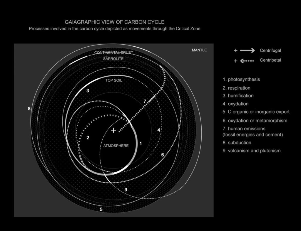
Nine major factors of the carbon cycle have been illustrated above. These interact through a combination of very long or relatively sudden processes. Some of those are at time-scales we rarely get to observe, such as (8) subduction and (9) volcanism and plutonism. Put simply, this is how parts of the planet’s crust can be pushed down into its mantle, to reemerge as a volcanic eruption or as a body of land pressed out into the biosphere by interior forces. The planet’s youngest mountain region, the Himalayas, was formed in this way, between 40 and 50 million years ago.
Understanding Gaiagraphy puts us on a path to sustainability
The diagram distinguishes between forces moving from the interior (the atmosphere) to the exterior (the mantle)—and forces or processes moving from the exterior to the interior. When we follow “the current” named C organic or inorganic export (5), we see that this is a very long process, which transforms into others. It moves from the top soil to the mantle and back. It created and compacted fossil fuel resources, and transported them into reservoirs deep underfoot. This took place over millions of years. As your eyes follow this “current”, other factors are revealed. Photosynthesis (1), draws carbon out of the air and creates plant matter; plants also carry out Respiration (2), which adds oxygen to the atmosphere (plants ranging from phytoplankton to tall sequoias). Through Humification (3), microorganisms decompose soil organic matter into inorganic components, ready to be absorbed by plants.
Until the industrial age, humans were unable to significantly tilt the balance of this cycle. Variation between conditions, such as ice-age maxima and minima, took place over thousands and millions of years. By extracting and burning coal, oil and natural gas, from deep deposits, we pushed an excess of carbon into the atmosphere, shown as Human emissions (7). Note how Human emissions cut through several layers, their suddenness illustrated by a sharp angle of attack, from the continental crust straight out to the atmosphere. While the Himalayas were pushed into place over several million years, humans have sent a mountain of carbon into the atmosphere in just 200 years.
Towards mapping our critical zone
Strictly put, the diagram above is novel only in the inside-out operation. The processes were known to us. We chose to ignore the connections, or pretend that they are without significance, compared to our more urgent economic objectives. Now, a tremendous joint effort is required, a global rallying of all hands on deck. It is necessary if we are to restrain the catastrophic consequences of global warming, resource overshoot and loss of biodiversity. Changing our point-of-view has proven of value before. Accepting that Earth was not the center of the Universe kick-started the scientific revolution. Realizing that we must engage with our biosphere, instead of believing we are independent of it, can significantly impel our efforts to repair Spaceship Earth.
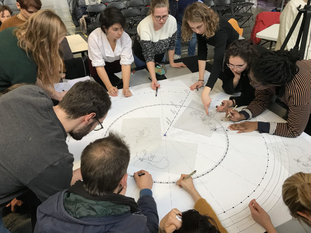
These students are developing a gaiagraphic map for a specific location. As you’ll see in later posts, the Gaiagraphic method provides us with a phenomenal tool for understanding local interplay and potential. It allows us to quicker grasp where we best can promote regeneration. The students are not bothering with the height and width of terrain features, nor plotting their exact location on a two-dimensional map. They are investigating and evaluating local biospheric resources, seeking optimal mitigation or amelioration, in order to drive sustainability. This link takes you to a video showing how the Gaiagraphy of the image to the right of my globus was developed. The students are developing a similar map of the critical zone in the location they have investigated. The data that informs their gaiagraphic is gathered from local surveys and records, as well as from remote sensing satellites. The result can speed up effective efforts to achieve long term sustainability, while reducing the risk of measures being adopted that are disconnected from biospheric realities.
A cruel paradox
We find ourselves in a paradox. Scientists trying to solve how we can live on Mars have come to realize they need to make a dead planet come alive. And the best way to do so, is to have Mars mimic the biospheric vitality of Earth—from the smallest of microbial activity in soil to processes that generate oxygen and draw CO2 from the air. A cruel paradox manifests, because we are doing the opposite on Earth. We are filling our atmosphere with CO2 and overshooting resource boundaries, in ways that threaten conditions for life on our home planet.
The Almanaut’s Journal of Journeys of Discovery to Mars and Earth investigates how we can slow the pace at which we are overshooting Earth’s resources, without causing unacceptable hardship. A first and necessary step is to make sure we are using the best possible maps for our journeys. We need to get rid of our old ones. More about Mapping our Critical Zone in coming posts.